Let's talk






Banking · RAQUEST / MiKaDiv
Beabstracto worked as UX consultancy for the vendor of a withholding-tax reclaim software. For a new reporting module under MiKaDiv and the modernisation of the established RAQUEST platform, we turned scattered domain knowledge into a reusable decision framework — and into a prototype in TypeScript that stakeholders at tier-1 banks took for finished software.
Beabstracto was UX consultancy for the vendor of a withholding-tax reclaim software (RAQUEST). The engagement covered two connected fronts: a new reporting module for the MiKaDiv notification procedure to the German Federal Central Tax Office (BZSt) and the UX modernisation of the established platform. Domain knowledge existed, but was scattered across developers, product owner and management. We translated it into a chain of artefacts — glossary, personas, process clusters, critical moments, UX tensions, design principles, information architecture — and into a TypeScript prototype for “Manage Reports” that stakeholders at tier-1 banks took for a finished product. Outcome: eleven reusable UX foundations and an MVP reference for the module.
For vendors of banking and tax software, the case shows how a new regulatory module becomes usable without lengthy training — and how UX decisions are documented so that engineering, product management and sales can reuse them.
All numbers come from the project artefacts as documented in the portfolio. Business metrics were not measured in this phase.
Project artefacts, portfolio documentation
Workshop voting, project artefacts
‘Critical moments’ workshop, project artefacts
TypeScript prototype Manage Reports
What was the starting point? An established vendor with deep domain knowledge, a new reporting procedure with a fixed date — and no explicit UX logic yet.
RAQUEST is a withholding-tax reclaim software established on the market for more than twenty years. Its vendor is an engineering-led organisation: developers, product owner and management know reclaim processes, custody chains and the requirements of the tax authorities from long practice. The software’s users are specialists in banks and at paying agents, not casual users. They work with deadlines, validation rules, four-eyes approvals, audit trails and technical evidence.
With MiKaDiv, the notification procedure for capital income and dividends, a new reporting duty to the Federal Central Tax Office (BZSt) is added. It applies for the first time to capital income accruing after 31 December 2026, i.e. operationally from 1 January 2027 (§ 52 (44b) EStG). Required to report are issuers (§ 45b (9) EStG), paying agents (§ 45b EStG) and central securities depositories (§ 45c EStG); the deadlines fall in the following year on 31 March, 30 April and 31 July (source: BZSt). For the vendor this meant: a new reporting module that has to run inside the existing ecosystem — validation-heavy, deadline-driven, with thousands of reports per period.
The people who process these reports sit in the specialist department of a bank or a paying agent: clerks who prepare and submit cases; experienced clerks who handle cases end to end and approve them under the four-eyes principle; team leads responsible for SLAs and throughput; administrators who maintain master data, rules and permissions. In the workshops, the vendor’s specialists described this daily routine with sentences like “What do I do now?” on unclear error messages, “The information is all over the place” when switching between screens and tabs, and “When will we hit the SLA?” when looking at isolated metrics without context.
More than a screen design was at stake. Errors in a regulated reporting process create SLA, legal, financial and trust risks. At the same time, modernising the existing platform must not damage established workflows or the trust of existing customers. Beabstracto was engaged as external UX consultancy to lead UX on both fronts; we led the UX work and coordinated one further designer from our studio.
What was the problem? Not missing domain knowledge — but a UX logic that was not yet explicit, not reusable and not tied to business decisions.
Developers, product owner and management each knew who uses the software — each from their own perspective. There were no prioritised personas against which trade-offs could be decided. Decisions sounded like “I think users would …” or “Let’s make it flexible for everyone”.
Business processes were discussed as features or screens, not as end-to-end workflows. Where value is created in the flow and where the SLA risk sits was not visible — and therefore neither was what must be built first.
Speed or safety? Guidance or free navigation? Automation or manual control? In a regulated environment these are not matters of taste but business decisions. Yet they were renegotiated per screen, depending on who happened to be in the room.
Everyone knew that deadlines and SLAs shape the daily routine. It just had not translated into interface behaviour yet: status displays, validation states, escalation signals, role-based actions.
At the core of the new module, operational users had to find, validate, fix, approve and trace thousands of reports per period — before deadlines slip, under the four-eyes principle and with a complete audit trail. In the team’s own words the system was still “passive”: you had to go looking for tasks instead of being told what to do by when, and why.
How did we go about it? In three working modes and along a chain of artefacts in which each one enables the next. As facilitator, we structured working sessions with developers, product owner and CEO to extract domain knowledge, surface trade-offs and prioritise risks. As translator, we turned regulatory and technical complexity into UX artefacts and product decisions the team can use every day. As maker, we built the prototype that let the team and prospects experience the product instead of imagining it. The artefacts were never independent deliverables: shared language enabled personas, personas clarified the relevant processes, processes revealed critical moments, critical moments became UX tensions, tensions became principles, principles became rules, rules became the information architecture — and the information architecture became the prototype.
Glossary and taxonomy first: what is an application, what is a claim, what is an income event? Who is an approver, what does the audit trail do, what goes to the BZSt via ELMA? Plus a regulatory mapping of MiKaDiv, deadlines and SLAs. Without this language, UX, product owner, engineering and management could not talk about the same product behaviour. The glossary grew to dozens of terms across RAQUEST and MiKaDiv.
With the team we collected user groups and client types and prioritised them by daily usage and business impact. Four personas emerged: the assistant clerk, who needs clear calls to action and guided processes with no room for interpretation; the professional clerk, who handles cases end to end and approves with an audit trail; the team lead, for whom SLA dashboards are the entry point; the system administrator for master data, rules and permissions. Assistant clerk and team lead became the primary design anchors — for MiKaDiv and for the platform’s shared patterns.
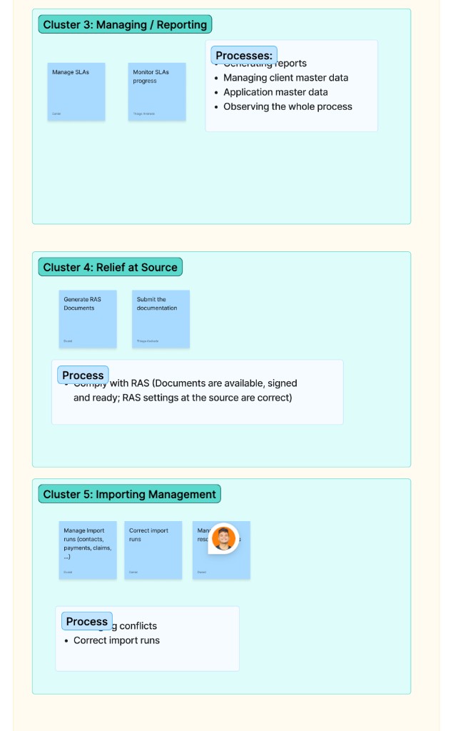
Instead of talking about screens, we collected end-to-end processes — submit a standard refund, four-eyes approval, monitor SLAs, correct import runs, generate relief-at-source documents — and grouped them into five clusters: standard and quick refund, system administration, managing/reporting, relief at source and import management. Each cluster was rated by frequency of use and damage on failure (SLA, risk, money). The most important product shift came out of this exercise: away from a passive system (“I have to go looking for tasks”) towards an informative one (“Do this by date X because SLA Y applies”).
Along the journeys the team named twelve critical moments — no import or export, missed deadlines, master-data changes overwriting manual corrections, wrong taxation rules, incorrect data from upstream systems, unclear error messages, review tasks assigned to the wrong user. Then the trade-offs: six UX tensions — speed versus safety, guidance versus exploration, flexibility versus control, transparency versus abstraction, automation versus manual control, visibility versus minimalism — were decided by team vote before anyone argued about a UI.
The winners of the tensions became eight design principles: safety over speed, guidance over free exploration, system control over flexibility, transparency over abstraction, automation over manual control, contextual visibility over minimalism, standardisation over excessive customisation, strictness before submission and forgiveness after. Each principle was translated into concrete rules: block invalid actions early and allow controlled recovery afterwards; show SLA status, blockages and missing documents without overloading the UI; never make rule-based decisions depend on users’ memory. A RACI-style permissions logic clarified who sees cases, who approves under four eyes, who monitors SLAs and who manages imports.
The information architecture linked roles, tasks and product areas into role-based entry points. The main journey for Manage Reports got seven steps, each with a clear intent: understand the period and workload, filter, identify issues, inspect details, fix and revalidate, approve or reject, monitor SLA progress. Information architecture and journeys were validated with stakeholders before any high-fidelity UI was created.
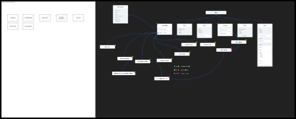
Figma alone would not have conveyed the operational behaviour: filters, status changes, bulk actions, report inspection, validation, logs and modal interactions had to feel real. So we built Manage Reports in TypeScript with realistic data: a list with period context and workload signals; advanced filters by period, client, country, ISIN, status, SLA and processing state; traffic-light validation with error counters; bulk approve, revalidate and reject; and a report detail with ten tabs — overview, ownership, income, payment chain, tax certificate, holdings, history, transmission logs, XML view, validation. Internally the prototype served as an alignment tool between engineering and management; externally it supported the vendor’s conversations with tier-1 banks.
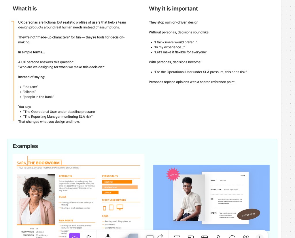
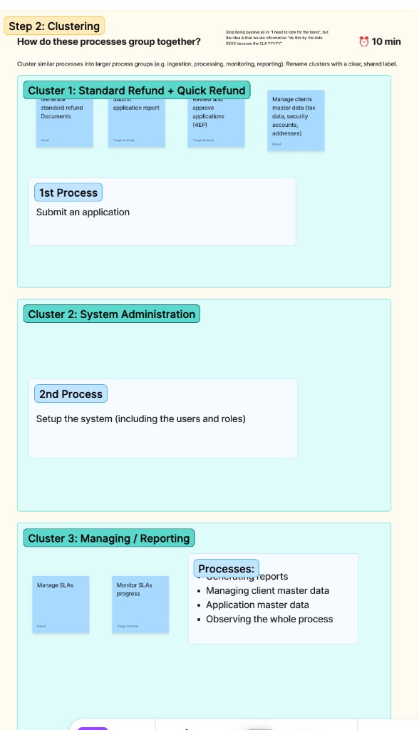
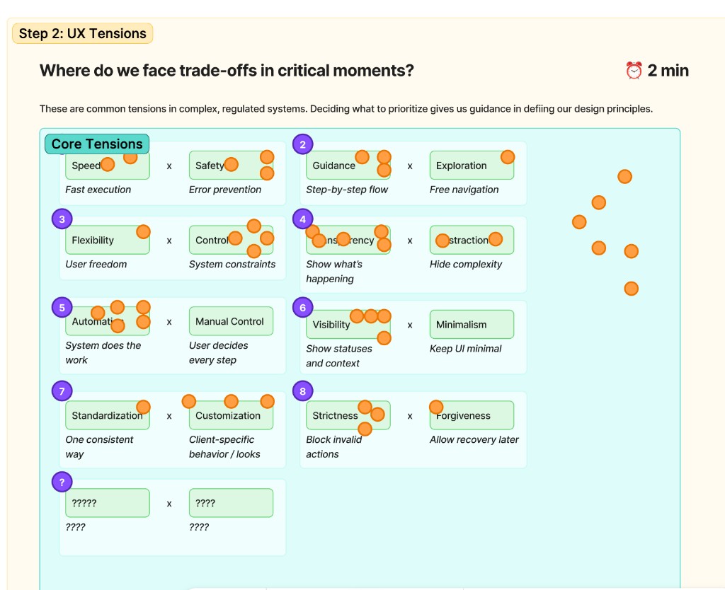
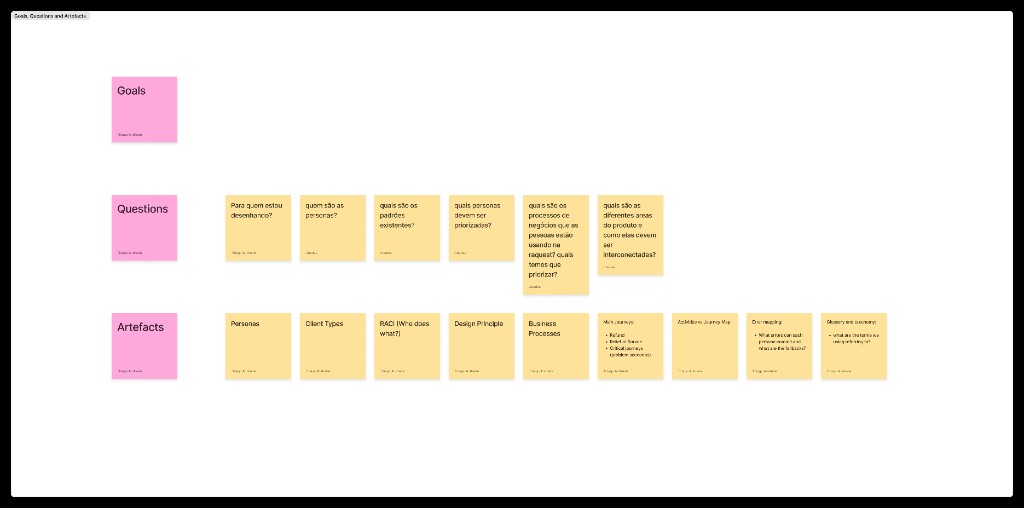
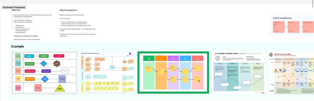
Selected boards from the foundation work — no client data and no product screenshots.
What was the outcome? A decision framework that carries both product fronts, and a prototype that turned a product vision into an MVP reference.
| Aspect | Before | After |
|---|---|---|
| Finding one report among thousands | Scrolling lists, switching screens and tabs, losing context | Filters by period, client, country, ISIN, status, SLA and processing state |
| Spotting validation errors | Unclear error message — “What do I do now?” | Traffic-light status, warnings, error counters and the next action |
| Approving reports | One-by-one actions, four-eyes principle only in people’s heads | Bulk approve, reject and revalidate with roles and audit trail |
| Seeing SLA risk | Only visible once the deadline has already slipped | Progress widgets, status distribution, SLA indicators, filters by deadline and risk |
| Proving transmission | Black box between approval and BZSt | Transmission logs, XML view, receipt and status information |
| Justifying UX decisions | Opinion against opinion, renegotiated per screen | Traceable to persona, process, critical moment and principle |
The TypeScript prototype made the MiKaDiv vision tangible enough that stakeholders at tier-1 banks took it for finished software. It became the vendor’s commercial and strategic reference point in conversations with banks.
Manage Reports became the concrete reference for MVP scope and expected product behaviour. Developers had a tangible model for filters, validation, bulk actions, audit trails and the structure of the report detail — instead of a list of requirements.
UI decisions could be traced back to persona needs, risk scenarios, process mapping and design principles. Instead of renegotiating per screen, there were reusable rules — for the new module and for the modernisation of the existing platform.
After tier-1 banks had engaged with the vision, Beabstracto stayed on in a broader UX lead role: from the foundations through product direction to MVP definition for MiKaDiv, in parallel with the modernisation of the RAQUEST platform.
This phase defined success indicators; it did not measure results: time to the right report, time to spot blocking errors, context switches per report, error-recovery success rate, throughput per reporting period, rework and support dependency during onboarding. They will be collected with stakeholders on the way into implementation.
„Wait … this is just a prototype? I thought it was a real product.“
Stakeholder at a tier-1 bank · during a product demo by the vendor
Transferable to other vendors of regulated software — without confidential details.
In organisations with deep domain knowledge, UX discussions rarely fail on knowledge; they fail on terms. A glossary that makes application, claim, income and approver unambiguous costs a few hours and saves weeks of misunderstanding between engineering, product and management. Everything else — personas, processes, principles — builds on it.
Safety or speed, guidance or exploration: in regulated systems these are business decisions. Naming them as opposing pairs and letting the team decide by vote yields principles nobody questions per screen anymore. That is the difference between opinion and rule.
The most valuable sentence of the project came out of process mapping: “Do this by date X because SLA Y applies.” A specialist system that shows deadlines, blockages and next steps, instead of waiting for people to go looking for tasks, cuts training effort and error rate at the same time. That holds for every reporting procedure with a cut-off date.
When behaviour is the product — filters, states, bulk actions, logs — a click dummy shows too little. A TypeScript prototype with realistic data lets engineering, management and prospects experience the same product. It does not replace implementation, but it does replace months of abstract requirements discussions.
A strategy and prototype phase does not deliver SLA rates. It delivers the indicators by which implementation will later be judged: time to report, context switches, rework, support dependency. Whoever fixes those up front can measure honestly after go-live — and does not have to invent anything in the case study.
We talk to vendors of banking and tax software about glossaries, personas, principles and prototypes — and to KVGs, depositaries and banks about implementation on the client side.
Book an intro call