Let's talk



Industry · Mobile maintenance app (iOS/Android)
For a vendor selling its app to many industrial clients, we designed an offline-first app for iOS and Android that lets technicians capture and read the health of electronic components in seconds. A token-based design system ships the same app under many industrial brands: a new brand is a configuration, not a redesign.
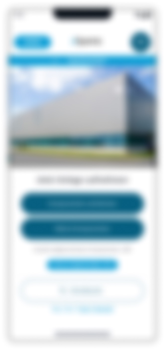
A vendor of maintenance software for industrial plants wanted a mobile app that lets technicians capture and read the health of electronic components — lifecycle, discontinuation, successors — right at the control cabinet, and sell that same app under the brands of many industrial clients. We owned the product design end to end: field context, information architecture, hi-fi flows for iOS and Android, a token-based design system with one Figma mode per brand, and the handoff to engineering. The app is live and used in production by manufacturers in aerospace, automotive, steel, food and consumer goods; a new brand is switched on with a mode instead of being redesigned.
Anyone selling HMI, MES or maintenance software to many plants knows both problems: the interface has to work in the worst moment, and the product has to scale without every client brand getting its own design. This case shows how both were solved together.
The project figures come from the project records and the design-system documentation; the market figure on downtime is an external source and serves as context.
Project records
Design-system documentation
Design-system documentation
The True Cost of Downtime, Siemens (2024)
What was the starting point? A maintenance team that cannot see in the field what sits inside its control cabinets — and a vendor that wants to sell its app to many plants under their own brands.
In a large industrial plant, a single failed electronic component can stop an entire line. An industry figure shows how expensive that gets: unplanned downtime costs the world's 500 biggest companies an estimated $1.4 trillion a year, about 11% of their revenue (source: The True Cost of Downtime, Siemens, 2024). Yet many maintenance teams do not know exactly which components are installed, where they sit, which lifecycle phase they are in, or whether the manufacturer is about to discontinue them.
That is precisely what obsolescence management under EN 62402 is about: a part counts as obsolete as soon as the manufacturer no longer supplies it to its original specification even though the plant still needs it — and whoever learns that only during a fault has not a spare-part problem but a procurement problem. For the maintenance technician this means every component has a discontinuation date, a status and, ideally, a recommended successor. This information was not in one place the technician could reach on site; there was no reliable place to record a component and look it up.
The persona is the maintenance technician in the plant. The critical moment is not the demo in the meeting room but the fault at 3 a.m.: the line is down, the technician stands in front of the open control cabinet with hands full of tools or wearing gloves, and the Wi-Fi in the hall is weak or absent. In that moment they are searching — instead of fixing.
The second side of the starting point is the vendor's business model. The app was not to be built for a single plant but sold as one product to many industrial clients — each under its own brand, with its own colours and logo. Maintaining every brand as a separate design variant would have made the product more expensive and slower with each new customer.
Our role covered product design end to end: research and field context, information architecture, complete hi-fi flows for iOS and Android, the design system including its multi-brand architecture, and the handoff to the vendor's engineering team. The case is anonymised: no client, product or brand names; screens are shown blurred for confidentiality.
What was the problem? Really two, each making the other worse: component health was invisible in the field, and the product had to scale across many brands without forking the design.
What is installed, where it sits, how old it is and whether it has been discontinued — none of that was available at a glance in the plant. The result: during a fault, the team searches for information instead of starting the repair. And a part whose discontinuation nobody knew about cannot be reordered when it matters.
Manufacturer, article number, ERP number, position in the cabinet: typing this data into a phone by hand takes time and produces errors — all the more with gloves, poor light and a stopped line behind you.
Teams could not find the right place to register a component or read its status. The information was scattered and not digitised. Without a structure that matches the plant, every capture ends up somewhere — and cannot be found next time.
Halls, lines, control cabinets, fields, thousands of components and their discontinuation dates: making all of that scannable on a phone demands an information architecture that matches the physical walk through the plant — not the table structure of the database.
In many halls, signal is weak or absent. An app that needs a connection to save is unusable for this job. At the same time, the technician has to know what is backed up and what is not.
The same app was to be sold under the identity of many industrial clients. Redrawing the design for every brand or forking the codebase would not have scaled — every new brand would have meant a small redesign.
How did we go about it? We recorded every major decision as Problem → Decision → Why, so that product management and engineering could follow why a screen looks the way it does and not otherwise. The phases: field context and as-is analysis, information architecture, capture flow, offline concept, reading component health, design system, platform-correct hi-fi flows and handoff.
First we defined the moment the app is built for: the fault at 3 a.m., technician at the control cabinet, hands busy, no signal. That picture became the test for every decision — not the demo in the conference room. From it followed the guiding principle: if it works with a line down and no Wi-Fi, it works everywhere else.
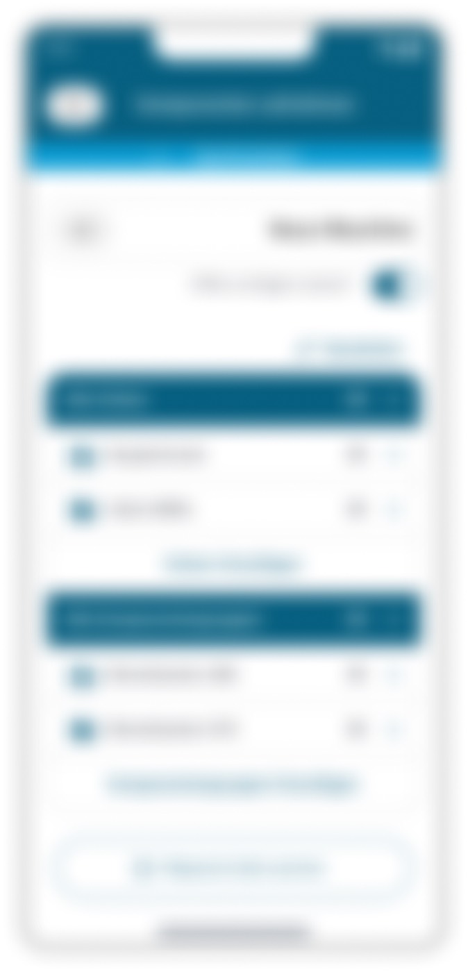
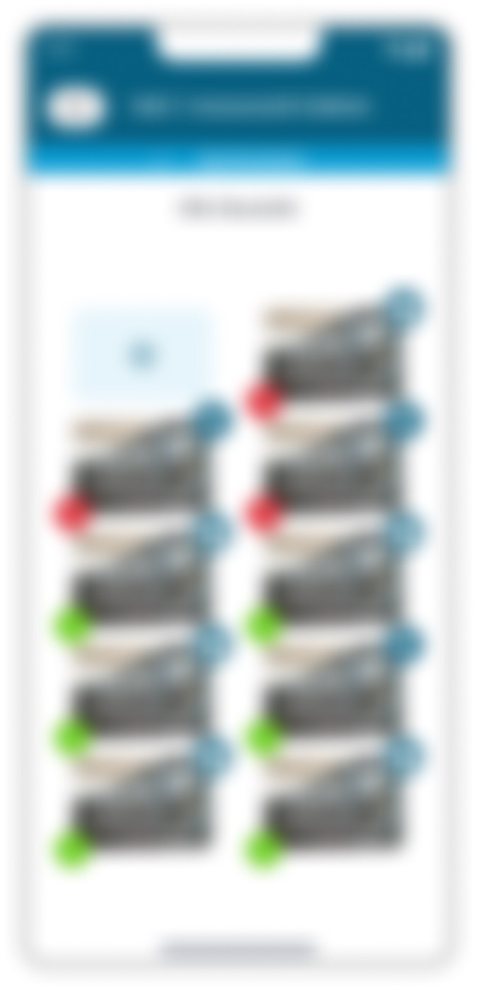
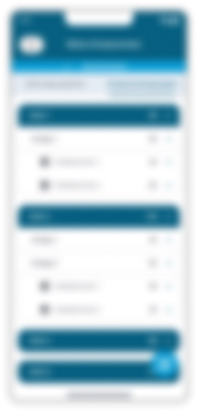
Maintenance people think spatially, so the app's structure follows the walk through the plant: hall → line or machine → control cabinet → component group (a terminal box, for example) → field (a slot in the cabinet) → component. The breadcrumb is the path the technician physically walked; every row in the list is a real place, not an abstract folder. The primary action — capture here, scan here — stays within thumb reach.
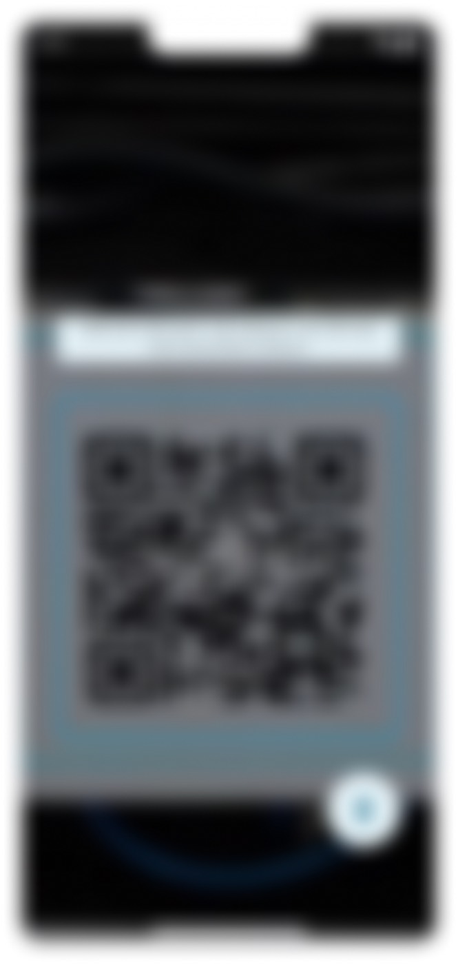
Instead of typing part data, the technician scans the QR code on the control cabinet, right where they stand. The app then guides them photo by photo through the required views — label, exterior, interior, detail — so nothing is forgotten under pressure. A large viewfinder and a one-tap shutter work with gloves on; a live count shows what has already been captured without leaving the camera.
Everything is saved locally and synchronised as soon as a connection is back. So that the technician trusts the system, the app shows on every folder and every photo whether it is backed up or still waiting. Offline is not a feature here but the baseline assumption: capture now, trust the sync later.
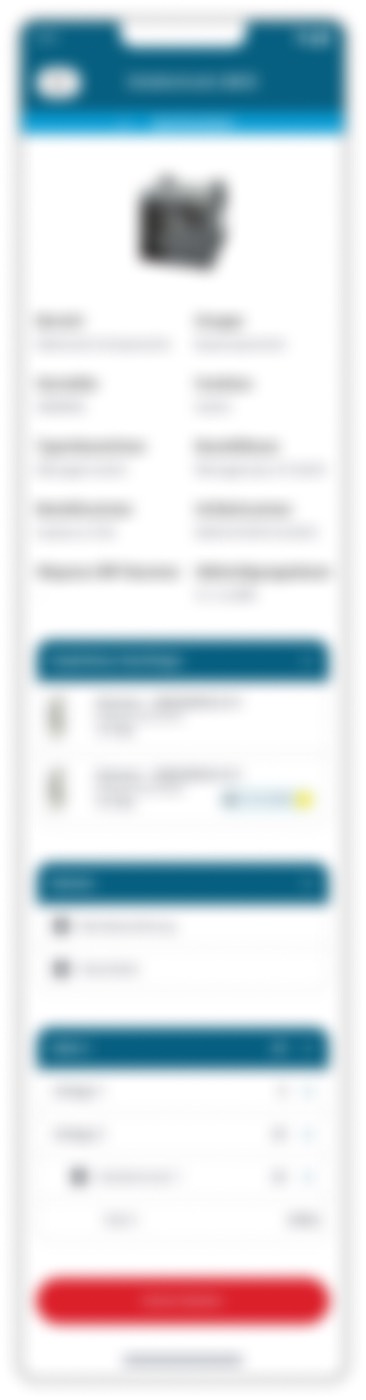
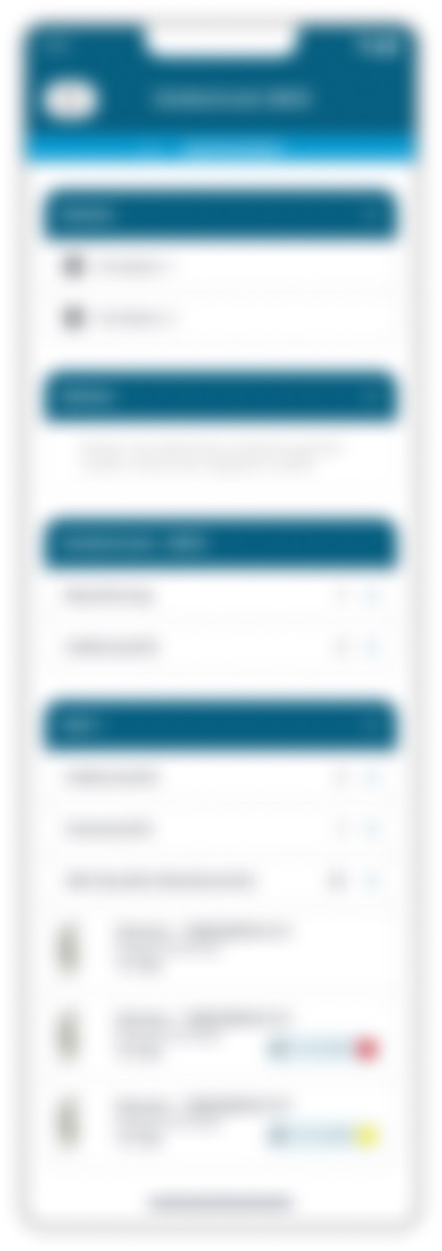
Above the fold, the detail page answers the only two questions that matter in a fault: what is this, and can it fail soon? A lifecycle badge in green, amber or red comes before the technical data. Below it: manufacturer, part, article and ERP numbers for ordering, the discontinuation date and recommended successors with stock and end-of-life, plus the manual and datasheet as attachments — without leaving the app. The home screen answers even earlier what needs attention: counts of registered and discontinued parts right at the top.
The answer to “one product, many brands” was a design system in three tiers: primitives (grey scale, brand hues, feedback colours), semantic tokens (surface, background, text, border) and components (buttons, list rows, status badges) that bind only to semantic tokens. The brand layer sits on top as Figma Variables with Modes. Switching one mode cascades through every tier. Onboarding a new brand means: add a mode, set about three brand colours, swap the logo — tints, states, shadows and typography re-derive. The grey scale stays stable across all brands.
We delivered complete hi-fi flows for iOS following the Human Interface Guidelines and for Android following Material Design — the same journey, implemented correctly for each platform. For the vendor's engineering team we documented the theming process so the team can set up a new client brand itself without triggering a redesign.

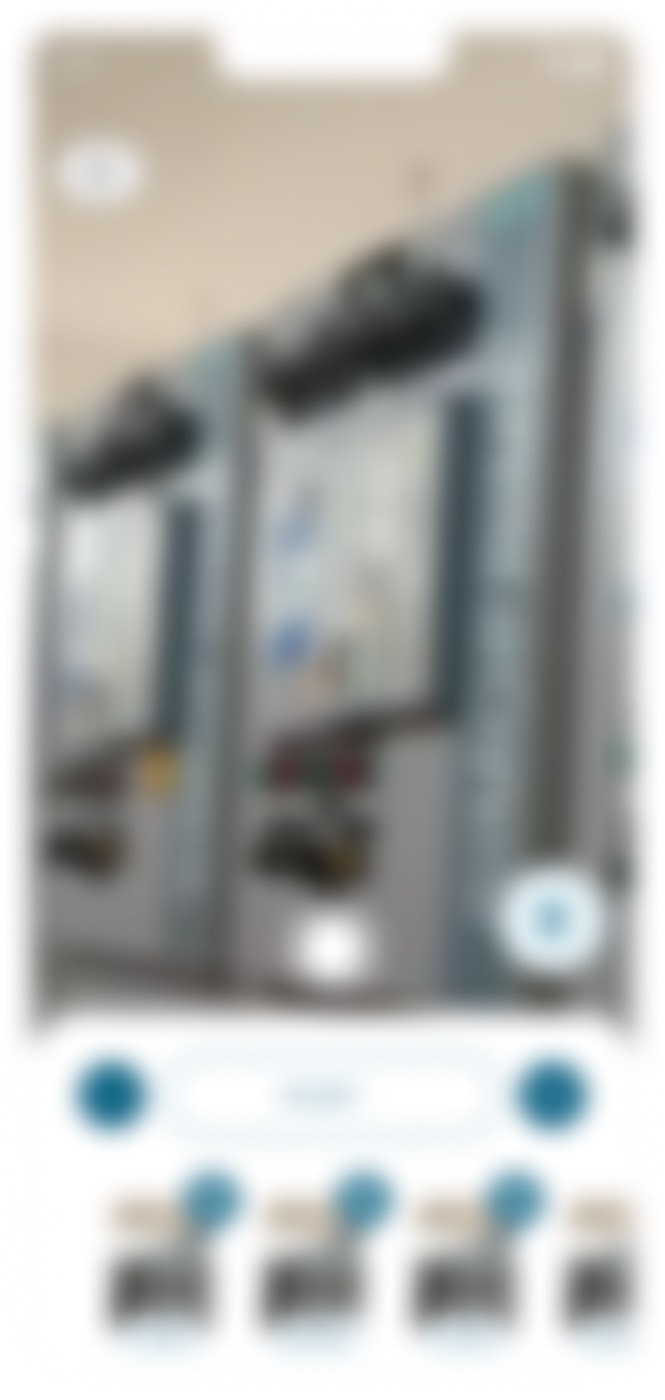

All screens are blurred for confidentiality; the captions describe the design decision, not the obscured content.

What is the result? The app went live on iOS and Android and runs in production at manufacturers across several industries — and every new client brand has since been a configuration change instead of a redesign.
| Aspect | Before | After |
|---|---|---|
| Capturing a component | Typing part data by hand — slow and error-prone | QR scan at the cabinet plus guided photo capture per view with a live count |
| Finding a component | No reliable place; information scattered and not digitised | Navigation along the plant: hall → line → control cabinet → field → component |
| Lifecycle and discontinuation | Unknown until a fault makes it visible | Traffic-light status, discontinuation date and successors with stock and end-of-life above the fold |
| Working without signal | Capture depends on reception in the hall | Offline-first: saved locally, synced when connected, sync state on every folder and photo |
| What needs attention? | Searching instead of fixing | Home shows registered and discontinued parts before the technician taps anything |
| A new client brand | Redraw the design per brand or fork it | Add a mode, set about three brand colours, swap the logo — the rest re-derives |
The app is used in production by manufacturers in aerospace, automotive, steel, food and beverage and consumer goods. The client names are under NDA; the case therefore names sectors only.
New clients are onboarded by swapping tokens, not by a redesign. The business model — one product, many brands — holds because the design system was built for it.
With QR scanning and guided photo capture, a technician registers around 70 components per hour on site (project records). The sync state on every folder and photo keeps the system honest about what is backed up and what is not.
The vendor's team received a documented system it can re-skin per client without involving designers — including the theming process, the token structure and platform-correct flows for both operating systems.
The decisive moment of use for a maintenance app is the fault with hands busy and no signal. Make that moment the test and the right decisions on capture, navigation and offline behaviour follow almost by themselves. The same holds for HMI, MES terminals and shop-floor software: the buyer sees the demo, the operator lives the emergency.
When the app's structure follows the physical walk — hall, line, cabinet, field — the technician needs no translation between screen and shop floor. Software vendors often carry the structure of their data model into the interface; for people who think spatially, that is the most expensive detour.
A white-label product only scales if components never point at raw colour values but at semantic tokens, and those at a brand layer with modes. Then a new brand is a configuration. What we would build in from the start next time: a token lint or visual-regression check in CI so that a single hard-coded colour value cannot silently break a brand mode.
Technicians trust an app only once they can see on every object whether it is backed up. A hidden sync produces duplicate captures and distrust. With more time we would instrument the field journey — time to capture, success rate from offline to sync — and feed that data back into the flows.
Building iOS to HIG and Android to Material costs little in design and saves a lot in the field: the interaction patterns match what the technician knows from their own phone. What remains open is the quality of field photos, which varies widely; lightweight on-device guidance (framing, glare) and a measured re-capture rate would be the next step.
We start from your operators' worst moment and build from there — field-first and scalable across many client brands.
Book an initial consultation